Detailed slide-by-slide text content extracted from this presentation.
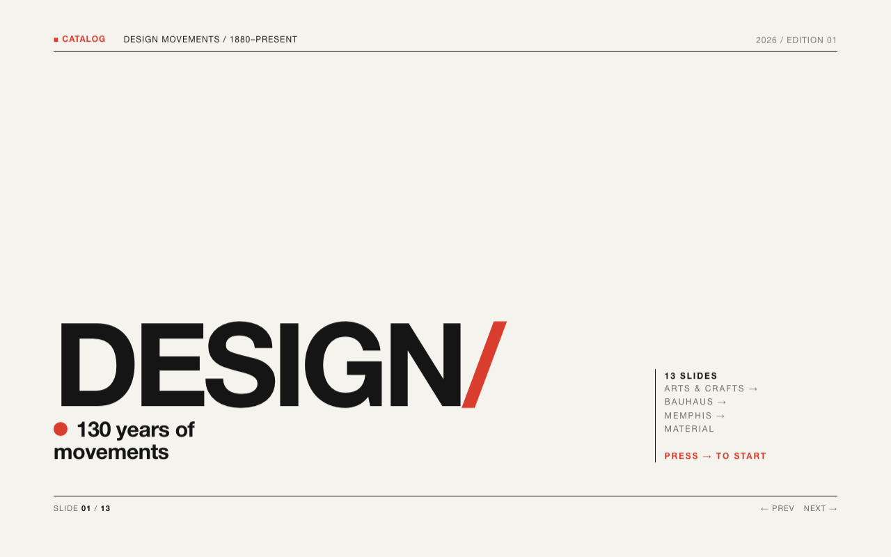
Slide 01
Graphic
Design
- A Visual History
- From Gutenberg's press to AI image generators — the art of making ideas visible has shaped every era of human communication and culture.
- 01 / 30
Slide 02
What Is Graphic Design?
- Definition
- Graphic design is the practice of combining typography, imagery, colour, and layout to communicate ideas visually. It bridges art and function — making information clear, beautiful, and persuasive.
- Visual communication with deliberate intent and purpose
- A discipline spanning print, screen, environment, and motion
- The intersection of art, psychology, and technology
- One of the most pervasive cultural forces of the modern world
- 02 / 30
Slide 03
Ancient Visual Language
- Origins
- Long before printing, humans designed with intention. Cave paintings, Egyptian hieroglyphs, and Chinese seal characters demonstrate sophisticated visual systems for storing and sharing meaning across time.
- Lascaux cave paintings (~17,000 BCE) — deliberate composition and pigment choice
- Egyptian hieroglyphs — pictographic writing with clear visual hierarchy
- Roman stone inscriptions — mastery of letter spacing and carved layout
- Illuminated manuscripts — colour, gold leaf, and ornate illustration combined
- 03 / 30
Slide 04
Gutenberg's Revolution
- 1450s
- Johannes Gutenberg's movable type press (~1450) democratised the written word and created the first true mass-medium — defining typography, layout, and page design for centuries to come.
- Uniform typefaces replaced irregular hand-lettering overnight
- Grid-based page layouts emerged from the constraints of the press
- The book became the first deliberately designed information product
- Within 50 years, over 20 million books were in circulation in Europe
- 04 / 30
Slide 05
The Power of Typography
- Core Element
- Typography is the art of arranging type to make language visible. Typeface choices carry personality, emotion, and cultural weight far beyond the words themselves.
- Serif
- Garamond, Bodoni, Times — authority, tradition, and the printed page.
- Sans-Serif
- Helvetica, Futura, Gill Sans — modernity, clarity, industrial precision.
- Display
- Expressive and decorative — used for headlines and brand identity marks.
- Monospace
- Courier, Consolas — code, precision, and retro-technology aesthetics.
- 05 / 30
Slide 06
Arts & Crafts Movement
- 1880s–1910s
- Reacting against industrial mass production, William Morris and peers championed handcraft, natural forms, and the unity of art with everyday objects — establishing design as both a moral and aesthetic project.
- William Morris's Kelmscott Press reimagined book design as fine art
- Ornamental borders, hand-set type, and luxurious handmade paper
- The designer as craftsperson with social responsibility to their audience
- Direct ancestor of Art Nouveau and the later Bauhaus school
- 06 / 30
Slide 07
Art Nouveau
- 1890–1910
- Flowing organic forms inspired by plants, insects, and the female figure swept across European design — appearing on posters, buildings, glassware, and jewellery in a unified aesthetic language.
- Alphonse Mucha's theatrical lithograph posters defined the Parisian style
- Sinuous curves, asymmetry, and exuberant decorative detail
- The colour lithograph poster became a popular art form in its own right
- Cities like Paris, Vienna, and Brussels became global design capitals
- 07 / 30
Slide 08
The Bauhaus
- 1919–1933
- Walter Gropius founded the Bauhaus in Weimar, Germany — uniting fine art, craft, and technology in a radical curriculum that revolutionised design education and practice across the globe.
- "Form follows function" as a guiding philosophical principle
- László Moholy-Nagy introduced photomontage and experimental media
- Herbert Bayer created the Universal typeface, abandoning capital letters
- Closed by Nazis in 1933; faculty emigrated and spread ideas worldwide
- 08 / 30
Slide 09
Russian Constructivism
- 1920s
- Following the 1917 Revolution, Soviet designers deployed geometric abstraction and bold typography in propaganda posters, film titles, and magazines — making political art with extraordinary visual force.
- El Lissitzky's "Beat the Whites with the Red Wedge" (1919) — iconic agitprop
- Rodchenko's dynamic photomontage covers for the journal Lef
- Primary colours, diagonal composition, and extreme tonal contrast
- Direct influence on mid-century Swiss and International Typographic Style
- 09 / 30
Slide 10
Swiss International Style
- 1950s–1970s
- Born in Zurich and Basel, the International Typographic Style championed mathematical grids, Helvetica, and objective information presentation — becoming the visual language of postwar corporate modernity.
- Josef Müller-Brockmann's grid systems remain industry standard today
- Helvetica (1957, Max Miedinger) — one of the most used typefaces in history
- Left-aligned ragged-right text; white space treated as a positive element
- Adopted by airlines, multinationals, and governments across the world
- 10 / 30
Slide 11
American Commercial Design
- 1940s–1960s
- Post-war America produced a golden age of advertising and corporate identity — Saul Bass, Paul Rand, and Lester Beall created logos and posters that still feel contemporary seven decades later.
- Paul Rand's IBM striped logo (1956) — speed, precision, and timeless elegance
- Saul Bass revolutionised film title sequences and poster design simultaneously
- William Golden designed CBS's Eye logo (1951) — still in use today
- Mid-century Modern aesthetic merged optimism with geometric rigour
- 11 / 30
Slide 12
Colour Theory in Design
- Fundamentals
- Colour is never neutral. Designers deploy hue, saturation, and value to direct attention, signal meaning, evoke emotion, and create brand identity — drawing on centuries of scientific and artistic study.
- Contrast
- High contrast commands attention; low contrast creates calm.
- Harmony
- Analogous palettes feel cohesive; complementary palettes vibrate with energy.
- Temperature
- Warm colours advance; cool colours recede in visual space.
- Psychology
- Red = urgency; blue = trust; green = nature; yellow = optimism.
- 12 / 30
Slide 13
Psychedelic Design
- 1960s
- The counterculture produced a visual rebellion: vibrating colour combinations, hand-lettered distorted type, and surreal imagery on concert posters for Grateful Dead, Jefferson Airplane, and Jimi Hendrix.
- Victor Moscoso mastered simultaneous colour contrast to dazzling effect
- Wes Wilson's iconic illegible-yet-readable Art Nouveau-derived poster fonts
- Art Nouveau forms merged with psychedelic and political imagery
- The concert poster became the album cover of visual counterculture
- 13 / 30
Slide 14
Punk and DIY Aesthetics
- 1970s–1980s
- Punk rejected professional polish. Cut-and-paste zines, photocopied flyers, ransom-note typography, and safety-pin iconography expressed raw energy and anti-establishment values with fierce authenticity.
- Jamie Reid's Sex Pistols artwork permanently redefined record sleeve design
- The Xerox machine as a democratising design tool for the masses
- Deliberate ugliness and rawness as authentic and honest communication
- Zine culture persists as a vital indie publishing tradition to this day
- 14 / 30
Slide 15
Postmodern Graphic Design
- 1980s–1990s
- Designers at Cranbrook Academy and April Greiman in California shattered Swiss rationalism — layering type over image, mixing historical styles, and embracing ambiguity over legibility and clear messaging.
- David Carson's Ray Gun magazine — typography deployed as pure texture
- Wolfgang Weingart challenged the very Swiss training he had mastered
- April Greiman used the Macintosh as creative medium from 1984 onward
- Deconstruction: breaking grids intentionally to reveal how grids construct meaning
- 15 / 30
Slide 16
Desktop Publishing Revolution
- 1984–1995
- The Apple Macintosh, Aldus PageMaker, and the LaserWriter printer gave individuals the power of a professional print shop — collapsing old professional barriers and igniting a new era of design democratisation.
- Mac + PageMaker (1985) together launched the entire DTP industry
- PostScript technology made resolution-independent fonts commercially viable
- Democratisation brought great design and design chaos in equal measure
- Adobe Photoshop (1990) transformed photo-manipulation and design forever
- 16 / 30
Slide 17
Branding & Corporate Identity
- Discipline
- Brand identity systems unify a company's visual presence across all touchpoints — ensuring that logo, typeface, colour palette, and tone of voice work together to create one coherent impression.
- Consistency builds recognition; recognition builds trust over time
- Landor, Pentagram, and Wolff Olins pioneered the brand consultancy model
- Nike's swoosh and Apple's apple are among the world's most recognised marks
- Rebranding can signal genuine transformation — or expose corporate panic
- 17 / 30
Slide 18
Web Design Arrives
- 1990s–2000s
- HTML, CSS, and then Flash expanded the designer's canvas to the browser — bringing new constraints (72 dpi, 640px width, dial-up speeds) that forced radical rethinking of visual communication.
- First websites: plain text, grey backgrounds, blue underlined hyperlinks
- Flash (1996–2010) unlocked animation and interactivity for the mainstream web
- CSS gave designers control over visual style separate from content structure
- The debate: Jakob Nielsen's usability versus David Siegel's visual expression
- 18 / 30
Slide 19
Motion Graphics
- Moving Image
- Adding time as a design dimension — motion graphics animate typography and illustration to tell stories in seconds. Film title sequences, broadcast IDs, and explainer videos are its primary forms.
- Saul Bass's Vertigo and Psycho title sequences redefined film design in the 1950s
- Kyle Cooper's Se7en titles (1995) relaunched the art form for a new generation
- Adobe After Effects democratised motion design across the 2000s
- Today: UI microinteractions, data visualisation, and social video storytelling
- 19 / 30
Slide 20
Flat vs. Skeuomorphism
- 2010s
- Skeuomorphism mimicked physical textures on digital interfaces — leather, felt, chrome. Flat design stripped all decoration for clean geometry and colour. iOS 7 (2013) made flat the dominant global paradigm overnight.
- Skeuomorphism: Apple's original iOS apps with felt, linen, and wood textures
- Microsoft Metro UI (2010) — a typography-first purely flat design language
- Google Material Design (2014) added layered depth through shadows and motion
- Today: neumorphism, glassmorphism, and deliberate textural revival movements
- 20 / 30
Slide 21
Principles of Logo Design
- Craft
- A logo is the nucleus of a visual identity. The most enduring marks share qualities that allow them to communicate instantly across all contexts, scales, and media.
- Simple — memorable at a glance and scalable to any size or medium
- Distinctive — unmistakably unique among all its direct competitors
- Versatile — works in black and white, reversed, and embroidered on fabric
- Appropriate — reflects the brand's genuine personality and sector
- Timeless — deliberately avoids trends that date within a few years
- 21 / 30
Slide 22
Infographics & Data Visualisation
- Information Design
- Making complex data comprehensible through visual mapping is one of graphic design's most consequential applications — from Florence Nightingale's rose diagram to modern interactive dashboards.
- Edward Tufte coined "data-ink ratio" — eliminate all non-essential ink
- Harry Beck's London Underground map (1931) — elegant spatial simplification
- Isotype system (Otto Neurath) — pictogram-based statistical communication
- D3.js brought fully interactive data visualisation to the web in 2011
- 22 / 30
Slide 23
Design Systems
- Modern Practice
- As digital products scaled, designers built comprehensive systems — reusable components, documented rules, and shared libraries enabling large teams to produce consistent, quality interfaces at speed.
- Google Material Design — first major publicly released design system (2014)
- IBM Carbon, Salesforce Lightning, Shopify Polaris quickly followed
- Figma made real-time collaborative design system maintenance possible
- Design tokens: decisions stored as variables and synced across all platforms
- 23 / 30
Slide 24
Typography Goes Digital
- Digital Type
- Variable fonts (2016) allow a single font file to contain an infinite range of weights, widths, and optical sizes — enabling typography that adapts to screen, preference, and animation.
- Google Fonts (2010) made professional typefaces free and widely accessible
- Web fonts ended the era of Arial and Georgia monopolising screen reading
- Variable fonts: one file, unlimited variation along multiple design axes
- Type as UX: readability and contrast are fundamental accessibility requirements
- 24 / 30
Slide 25
Design as Social Force
- Social Impact
- From wartime propaganda to social justice campaigns, graphic design operates at the intersection of power and persuasion — capable of mobilising millions and shaping the direction of history.
- Shepard Fairey's Obama "HOPE" poster (2008) — defining viral political image
- AIDS awareness campaigns redefined public health communication globally
- Climate movement: bold extinction imagery communicating existential urgency
- "First Things First" manifesto (1964, reissued 2000) — designers' ethical duties
- 25 / 30
Slide 26
AI and Generative Design
- 2020s
- Artificial intelligence tools — Midjourney, DALL-E, Adobe Firefly, Stable Diffusion — now generate images, logos, and layouts from text prompts, fundamentally challenging the role of the human designer.
- Generative tools can produce one hundred logo concepts in seconds
- AI raises urgent questions of authorship, copyright, and creative credit
- The best designers use AI as a creative partner, not a wholesale replacement
- Prompt engineering is the new layout and composition skill for visual creators
- 26 / 30
Slide 27
Core Design Principles
- Principles
- Regardless of era or medium, great graphic design returns to timeless principles that govern how the human eye and brain perceive and process visual information.
- Hierarchy
- Guide the eye through deliberate use of size, weight, and position.
- Contrast
- Meaningful difference creates visual interest and directs attention.
- Alignment
- Nothing placed arbitrarily — every element connects to a system.
- Repetition
- Consistent elements build unity and reinforce brand recognition.
- 27 / 30
Slide 28
Designers Who Changed Everything
- Icons
- Paul RandIBM, ABC, UPS identities — defined the language of corporate Modernism in America.
- Saul BassFilm posters and title sequences that transformed opening credits into high art.
- David CarsonRay Gun magazine — deconstructed readability to release raw emotional energy.
- Stefan SagmeisterProvocative album covers and self-initiated experimental work pushing design's limits.
- Herb LubalinTypographic genius: U&lc magazine, ITC typefaces, and supremely expressive lettering.
- Massimo VignelliNYC Subway map, American Airlines identity — "If you can design one thing, you can design everything."
- 28 / 30
Slide 29
The Future of Graphic Design
- Future
- Graphic design continues to expand — into spatial computing, generative systems, and environmental design — while its core mission remains unchanged: making ideas legible, memorable, and beautiful.
- Spatial design for AR and VR — composition in three-dimensional environments
- Generative and algorithmic systems that evolve and personalise over time
- Inclusive design: accessibility as creative constraint and ethical opportunity
- Sustainable design: reducing material and carbon cost of visual production
- The designer as strategist, systems thinker, and cultural communicator
- 29 / 30
Slide 30
Design Is the Space Between
Problem and Solution
- Takeaway
- From the Gutenberg press to AI image generators, graphic design is humanity's ongoing project of making thought visible. Every era adds new tools, but the fundamental craft — clear, beautiful, purposeful communication — endures and matters.
- 30 / 30